A Fascinating Way To See Bubbles Within The Stock Market
Asset bubbles are notoriously difficult to identify as they are happening. Often times, they only become clear in hindsight.
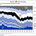
Having said that, Goldman Sachs’ David Kostin offers an interesting stock market chart in his team’s new US Quarterly Chartbook.
It shows the sector composition of the S&P 500 by market cap since 1974. As you can see, sector bubbles manifest when they suddenly explode as a percentage of the S&P 500.
The dotcom bubble is very prominent, represented by the ballooning info tech sector stocks. The credit bubble appeared much more gradually as seen in the rise of financial sector stocks.
“Financials was only the third sector since 1975 to represent 20% of the market capitalization of the S&P 500,” noted Kostin. “However, Financials share of the S&P 500 market cap has declined from 22% to as low as 9% in early March 2009.”
Goldman Sachs
Read article here:
A Fascinating Way To See Bubbles Within The Stock Market
See which stocks are being affected by Social Media