
Credit Markets Signal Stock Market Party To Continue In 2014 …
Ben Bernanke’s gift to the markets on Wednesday December 18, 2013 in my review was really no big surprise. What would have been a surprise was an announcement that in the coming year the Fed was actually going to move to a neutral monetary policy. But, as I stated in my last article, “now is not the time to exit stocks”. Currently the signals are simply not ripe for a stock market breakdown because there is no resistance in place to trigger such an event. If you have the chance to read my book, Theory of Financial Relativity, you will have a much better understanding of the history behind my perspective and forces and metrics to be wary of when a true market correction is about to take place.
The stock market (SPY) (DIA) (QQQ) in 2013 will post gains which will rival many of the best years since WWII. And, the gains are not being posted in the year following a recession, a more common occurrence. And yet, the Fed is projecting by my estimation over $500B in additional asset purchases of Treasuries and Mortgage Backed Securities in 2014. This asset buying program will be the 3rd greatest bond buying program in Fed history behind the $1T purchase in 2013 and $600B in QE1 – hardly a step toward tightening. In addition, if the market does not produce the growth the FOMC has determined to be the level required to remove the training wheels, then the aggressive program will continue. Under any circumstance, near zero short term interest rates are planned to be maintained through the end of the Obama Administration.
The confusing aspect of this market for many investors is determining if stocks can continue to rise in the wake of such high gains, and what the signals will be in the event the market is truly going to undergo a correction. In the current zero interest rate environment, the short term rate market is pegged by the Fed. Normal signals such as a Fed Funds rate increases will not work. In addition, fundamental correlations of private economy revenue and earnings growth are simply not correlated to stock price action. Fundamentals have not mattered since 2008, and there is little likelihood of this dynamic changing as long as the Fed continues the zero rate policy.
What approach should investors take to review the potential for price appreciation in their portfolio in 2014? The answer lies in the flow of funds momentum and the signal to look for when the demand for stocks is likely to wear thin. Reliable measures of elevated risk are hard to find in the current government price controlled market. However, I believe the long end of the term structure of interest rates is about to become one of the better indicators for investors to begin tracking.
Long Duration Credit Market as a Leading Indicator
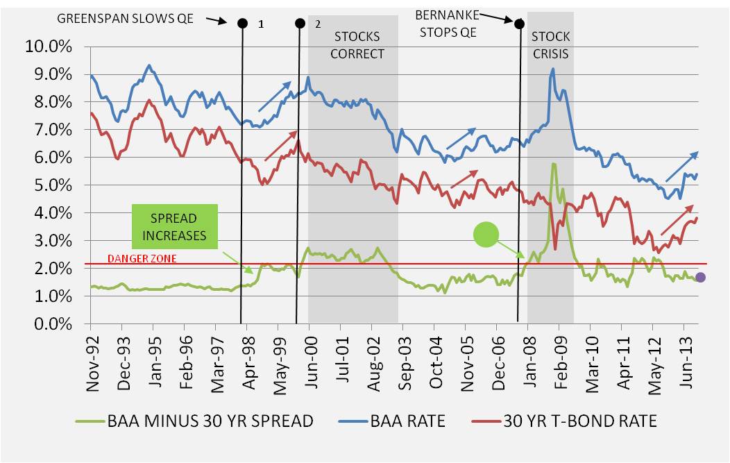
In the graph below the long term interest rate market is shown from late 1992 to December 2013. Although I could have gone back much further in time, the recent history is indicative of the typical interest rate patterns during Fed accommodation through monetary tightening episodes. The important risk measure to follow in the graph is the spread between the 30 Year Treasury Bond Yield and the BAA1 Seasoned Corporate Bond Yield tracked by Moody’s. The spread is indicated by the green line in the graph. The absolute level of interest rates on the 30 Year Treasury (red line) and BAA1 (blue line) are also show in the graph.
The difference in yield between the long duration corporate and Treasury market is an excellent reflector of the risk level in the financial market through time. This measurement usually maintains a spread of about 1.5% during expansionary economic time periods. During the early 1990s through mid 1998, the BAA1 / 30 YR Treasury spread was low and well behaved. In 1998 the spread began to widen and approached an elevated level of 2%. This time period corresponded to the East Asian Financial Crisis which began in 1997 and the eventual Russian debt default in 1998. This period was marked by a breakdown in the worldwide pricing of commodities, somewhat similar to the financial market phenomenon being experienced in 2013.
An important aspect of the monetary and fiscal policy in the late 1990s was the slowing of additions to the Federal Reserve balance sheet leading up to the widening of the spread in early 1999, while at the same time Federal government borrowing was contracting. In response to lower Fed purchases the BAA1 and 30 YR Treasury interest rates bottomed and began to rise as indicated by the tick up in the spread on the graph in mid 1998. Most likely due to the Russian debt crisis during this time, the Fed increased asset purchases and lowered the Fed Funds rate in the second half of 1998 into 1999. As interest rates continued to rise, eventually Greenspan returned to slow QE for a second time in the second Clinton term post the year 2000 celebration. It was the second point of monetary tightening that pushed the BAA1 / 30 YR Treasury spread well above the 2% level, approaching 2.75% in May 2000. Financial history reflects the stock market breakdown in the summer of 2000, reaching an eventual reversal low point in February 2003.
Flash forward to the end of the Bush presidency and the infamous mortgage market meltdown. In this time period the BAA1 / 30 YR Treasury spread was certainly more volatile than the second Clinton Administration term, but the measure remained below the 2% threshold until 2008. Then, as the banking system began to choke from a lack of liquidity, the spread began to blow-out to historically high levels. When I review the Fed balance sheet in the year 2008 prior to the Lehman Brothers rescue, it leaves little wonder that the banking system went into cardiac arrest. Throughout 2008 the Fed was holding its asset holdings steady, even selling Treasury bonds and exchanging them for mortgage backed securities. The actions taken in 2008 are diametrically opposite to the present course being taken by the Fed. One of these days maybe someone will provide a logical explanation of why the Fed chose to cure a liquidity crisis by draining banking system reserves as a first step, and then enter in September 2008 with $1.2T in TARP funding, and the government is now using liquidity to cure and aggregate demand problem – but I digress.
By the end of 2008 as President Obama was in the process of transitioning into office the BAA1 / 30 YR Treasury spread topped out at 5.76%. Investment grade credit was being sold at very steep discounts. And, of course, riskier credit was dirt cheap. I recall loading up on Ford (F) bonds at 12 cents on the dollar. GM (GM) bonds took a similar bloodbath; however, they did not fare so well …
BAA1 / 30 YR Treasury Spread Today
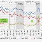
What is the long-duration credit spread today, and what information does it provide investors? The purple dot on the graph above shows the spread is in the lower risk zone of 1.5%. The graph below provides a view of the recent pricing action in more detail. The choppy nature of the spread measure and the repeated runs at the 2% level post the 2008 financial crisis shows a very risk-averse market up until 2013. However, since QE3 began at the beginning of 2013 the measure began to resemble the 2005-2006 and the 1996-97 periods in history. Probably more indicative of the first year after Alan Greenspan moved rates up from historically low levels in 2004, long-term rates have been on the rise in 2013 despite the Fed $1T asset purchase program. It may surprise many investors that the Fed was still purchasing assets as interest rates were rising in the 2005 time period. However, the purchases were in the $5B a month range, not $50B, and the total size of the Fed balance sheet relative to total U.S. publicly traded debt was being held constant at approximately 16%. In the coming year under the announced 2014 Fed taper plan, expect the Fed to become an even bigger owner of outstanding Treasury securities. Presently the Fed owns 17.7% of the U.S. Treasury public debt and an even bigger percentage of all government mortgage backed securities.
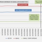
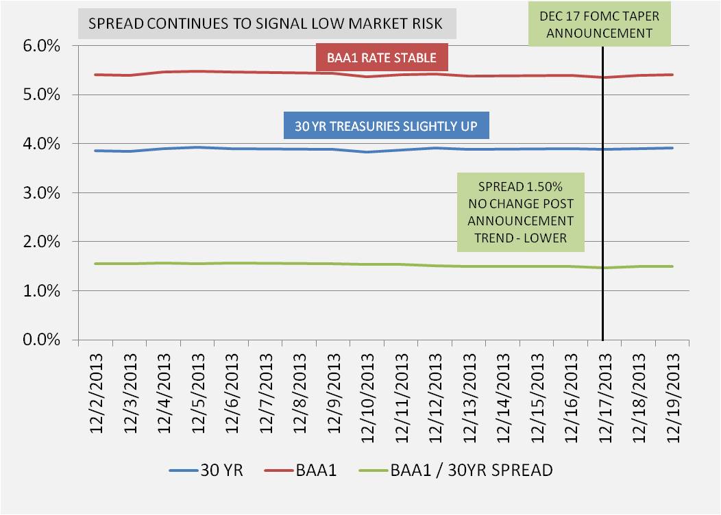
The graph above shows the pricing action in the 30 YR Treasury and BAA1 Corporate bond market leading up to the December 18th FOMC taper announcement, as well as the trading the day after. The real news is that it was a non-event in the long duration credit market. The interest rate increases that occurred in May through the summer months of 2013 seem to have priced in the expectation that the Fed bond buying would continue through 2014 before returning to normal levels. The lack of movement in both the spread and the absolute level of long bond interest rates at this time is a positive indicator for stocks and riskier assets. In fact, the higher beta stocks and ETFs (SPHB) in the airline (LUV) (AAL) (DAL), exploration and production energy (XOP) (PSCE) (IOE), and technology sectors (PSCT) (IGN) (IYW) (IGV) (PSJ) all exhibited superior performance post the announcement.
Yield Curve Signaling Movement into Riskier Assets
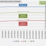
Another indication of the market rotation to riskier assets can be seen in the Treasury yield curve from December 2nd through the 19th.
In the graph above, the gradual rise in yield of the 5 YR Treasury relative to the longer dated maturities both pre and post the FOMC taper announcement is important information. It reflects the beginning of a flattening of the yield curve which typically marks an expansionary economic phase. Since the Fed is pegging interest rates, the short end of the curve is distorted. However, longer dated maturities have begun to reflect real economic activity. Selling of mid-term Treasuries and demand showing up in alternative, riskier assets is a positive market signal. Eventually the cost of 5 year money will reach a point where it competes with investment alternatives on a risk reward basis; however, presently the trend is moving in the opposite direction. This is a bullish stock signal.
Currently, credit market signals show the stock market can continue to rise in 2014 with low risk of a major correction. Much of the initial market move up in anticipation of economic growth is already priced in with the move up since the spring of 2013, so a brief pull-back after the first of the year is possible as portfolios are rebalanced; however, a major market break-down in 2014, in my opinion, would require a severe negative tail risk geopolitical event to occur. If you are interested in my estimate of the potential stock market upside in 2014, I have utilized a unique method to derive a potential 12.5% gain on the DOW to 18000. The analysis is posted on my Financial Market Vigilante blog in the article Stock Market in 2014 – Can the Run Continue?. I usually avoid absolute market forecasts because they are inevitably wrong; however, the one estimate which appears firm is that the stock market party will continue over the intermediate term…and those who choose to follow the credit market signals will get fair warning when trouble finally approaches.
Daniel Moore is the author of the recently published book Theory of Financial Relativity – Unlocking Market Mysteries that will Make You a Better Investor. All opinions shared in this article are expressly his own, and intended for information purposes only.
Source:
Credit Markets Signal Stock Market Party To Continue In 2014
Disclosure: I have no positions in any stocks mentioned, and no plans to initiate any positions within the next 72 hours. I wrote this article myself, and it expresses my own opinions. I am not receiving compensation for it (other than from Seeking Alpha). I have no business relationship with any company whose stock is mentioned in this article. I have long positions in technology and energy sector stocks. (More…)
Link:
Credit Markets Signal Stock Market Party To Continue In 2014 …
See which stocks are being affected by Social Media

