

In Search of a Stock Market Bubble
So, (the sentence starts with “so” because this is a sort of ongoing discussion that’s been going on here for years) I’ve been thinking about the overall market again. Despite my telling people to ignore this and ignore that, I can’t help it; sometimes I think about this stuff. Well, it’s OK to think about it as long as it doesn’t lead to irrational decisions.
Anyway, as usual, there is a lot of talk of the market being insanely overvalued, median P/E’s at post war records and all the usual.
Printer-friendly Version Email This Article
I look at the charts and some are scary, but I still don’t get the sense of a bubble. I’ve seen the Japan bubble in 1989, the 2000 internet bubble and some others. I see the Chinese bubble going on right now. But I still don’t really get the sense that the U.S. stock market is in a bubble. Yes, there is a pocket of bubbliness, like in some parts of the tech sector (social networks, biotech etc.), but overall I just really don’t see it.
Like Black Monday?
Also, there were comments to the effect that 2015 feels
just like 1987 before Black Monday because interest rates spiked up right before the stock market crash. Well, back then the stock market was at 20x P/E and bond yields spiked up to 10%. So that was a Fed model yield gap of a whopping 5% (earnings yield of 5% versus bond yield of 10%).
Today, we are talking about interest rates spiking up to 2.5% with the P/E ratio under 20. So in that sense, there is no stretched rubber band ready to snap based on interest rates. And I showed in recent posts that the market is fine with interest rates spiking up to 6% (of course there will volatility based on that, though).
Nifty Fifty 1972
I made a post just like this one two or threes years ago when people were saying the market is overvalued. I looked up the P/E ratios of the Nifty Fifty stocks in 1972 to see what a real bubble looks like.
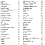
Here is what you were dealing with if you were investing in blue chip stocks back in 1972:
What is really interesting to me here is that the S&P 500 index P/E ratio at the time was 19.2x. But look at the nifty fifty P/E ratios. To me, this is what a bubble looks like. These ‘ordinary’ companies were trading at higher P/E’s than high growth social network stocks or fast casual restaurant chain today!
So, while everyone focuses on the big scary charts of market P/E ratios and whatnot, let’s just look under the hood and see what’s actually going on.
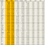
To be totally neutral, I just picked the Dow 30 stocks. They are large caps, representative of major U.S. companies. Despite the horrible structure of the index (price-weighted), it does correlate pretty closely with the S&P 500 index. I plan on looking at the S&P 500 index in the same way in the near future.
Dow Jones Industrial Average Component Valuations
I just scraped this data off of Yahoo Finance. I ranked it from cheapest up based on forward P/Es.
It’s sometimes a good idea, when trying to figure something out, to invert. To get comfortable being long something, let’s see what it would feel like to be short it instead (just because it’s not a good short doesn’t automatically make it a good long, though).
Originally posted here:
In Search of a Stock Market Bubble
See which stocks are being affected by Social Media

