
Stock Market Intra-Year Decline Chart – Business Insider
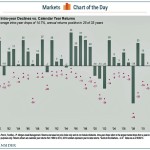
There’s always some pain to endure.Perhaps there’s no better encapsulation of that market maxim than this chart from J.P. Morgan Asset Management’s Paul Quinsee.It shows S&P 500 intra-year declines versus calendar year returns. The bar represents year-end returns since 1980, while the little purple dot shows how low the market went each year.What you find is that investors must […]
