
The Position Of The Stock Market Right Now | Seeking Alpha
Summary
Is recent stock market action significant or just a blip to Dow 40,000?
What is the market telling us from a historical perspective?
Does this market pass the “eye” test?
The recent stock market action reminds us that it is important to evaluate the broader picture. This comment applies whether you are a trader taking a position for as little as a day, or an investor who is comfortable just looking at monthly brokerage statements. When bullish market runs experience longevity, emotions convince investors that “this time is different” or that we are in a “new normal.”
A factor present in the markets today is historic central bank involvement. The central bank and government are part of the “Wizard” complex I refer to in my book and other writing. People have grown accustomed to government as “pater familias” and central banks as guardians of the market. Investor trust in the Wizards is unprecedented. Investigative reporter Bob Woodward of Watergate fame authored a book calling former Fed Chairman Greenspan, “Maestro”. As Dorothy ultimately discovered when Toto pulled back the curtain, the Wizard was an ordinary man.
In this article, I provide a summary of various indicators to provide a clearer picture of where the stock market is in early August of 2014. The reader can judge the efficacy of the analysis.
Trend-following Algorithm
I developed market analysis software featuring trend-following algorithms for three time horizons (short, medium, and long-term). The Short-Term (ST) indicator encompasses daily price movement, the Medium-Term (MT) indicator looks at weekly patterns, while the Long-Term (LT) indicator focuses on monthly price action. Other horizons could certainly be employed. For example, I have seen many charts that track price movement in 5 minute increments, certainly appealing for day traders. I simply chose those three for the sake of simplicity and convenience.
Understandably, the ST indicator oscillates the most of the three. Throughout the course of a given year, the ST indicator can change from bullish to bearish and vice versa many times. Prior to the last week of July, the ST indicator turned bearish in the Dow only once in 2014 and that was at the beginning of the year. The MT indicator did not turn bearish in January nor in the last week of July/first week of August. Since the market bottom of 2009, the MT indicator has turned bearish only twice (June 2011 and May 2012). The LT indicator has never turned bearish since the 2009 bottom. The trend in all three time horizons has been overwhelmingly bullish since 2009.
It is entirely possible that the MT indicator could turn bearish well ahead of its LT brethren. Just seeing the MT indicator turn bearish would not be enough, in and of itself, to declare the move from 2009 over. That said, other evidence gathered could allow me to turn bearish just on the basis of the MT indicator, in case I did not want to wait for the LT to change.
Expanding Triangle
The Expanding Triangle, also known as “Megaphone” or “Alligator Jaws of Death” is a chart pattern often seen near market tops. The pattern is associated with panics and economic contractions and is corrective as opposed to impulsive. This implies that the action since the year 2000 is corrective in nature. The reader may question this statement since the Dow Jones Industrial Average (DJIA) is higher than it was in 2000. While true in nominal terms, the DJIA has actually been in a persistent decline since 2000 when expressed in ounces of gold. Additionally, the DJIA expressed in terms of the Personal Consumption Expenditure (PCE) is also lower now than in 2000. The PCE is the Fed’s preferred inflation measure. Even if you disagree with the PCE as an inflation tool, it should give pause that the DJIA, measured with the PCE, is lower now than in 2000.
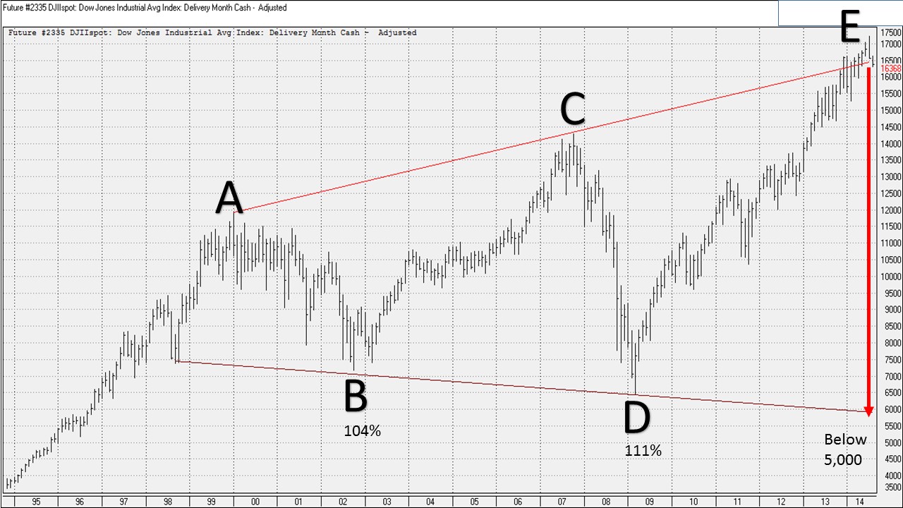
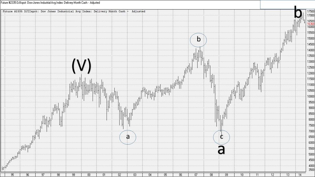
Figure I
Figure I shows the current Expanding Triangle spanning 14 years. The components (waves) of the triangle are labeled A through E. By rule, each wave retraces 100-150% of the previous wave within the triangle. Wave B retraced 104% of Wave A. Wave D retraced 111% of Wave C. Thus, when Wave E retraces, it will move below the point labeled D for a drop of at least 12,000 points signifying a DJIA at 5,000 or lower. The timing of the decline is not specified by the triangle pattern since the market could continue along the line ACE. The triangle simply identifies the depth of the subsequent move.
The expanding triangle formation occurred during the following stock market tops: 1929, 1957, 1966, 1973, 1987, 2000, and to a lesser extent 2007. The differences between the current triangle and the historically cited cases are the length and breadth of the expansion as well as the geometric precision of the current model. This simply reinforces what will be a larger retracement when Wave E completes.
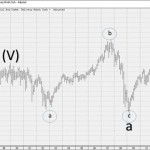
Elliott Wave Pattern
Ralph Nelson Elliott developed the eponymously named wave pattern that identifies the position of a market based on a labeling system identifying waves that are self-similar at different degrees of scale. Like the expanding triangle analysis above, the current Elliott labeling suggests the move from 2000 is corrective with the next wave, to be labeled “c“, exhibiting similar or greater breadth as the move from point E in Figure I. Figure II illustrates the current Elliott Wave labels (wave label assignment courtesy of Elliott Wave International).
I simplified the labeling for the purpose of this analysis and am only displaying the major waves that have been most impactful. Wave b, in effect since 2009, is a very deceptive wave. One word to describe market action in this wave is complacent. I recently penned an article in this section of cyberspace discussing the various ways in which this market demonstrates great complacency. Like the expanding triangle, these waves do not predict specific timing but they do present a clearer picture of the market’s position. Probabilistically, Elliott Waves show a market at or very near a very significant top.
Figure II
Dividend Yield
The dividend yield is a ratio expressing the dividends paid per share divided by the stock price. Think of the dividend yield as a measure of cash flow for each share of stock owned. Aggregating this concept to the broader market, we can evaluate how much cash flow the various indices (DJIA, S&P 500, NASDAQ) return on average. The average current yield of the DJIA is 2.80%, for the S&P it is 2.01% and for the NASDAQ 100 it is 1.13%.
A common refrain suggests that dividend yields are historically low because interest rates are low. This implies that high prevailing interest rates would drive a high dividend yield for the market as a whole. This argument loses strength given that the all-time low dividend yield (1.4%) in the DJIA occurred in 2000 and the 10-year Treasury rate was around 6.5%. Presently we have a higher dividend yield but a much lower 10-year rate (2.43%). To be fair, however, it should be noted that both 10-year rates and dividend yields have trended lower since the important stock market low of 1982. Throughout the Great Depression, however, 10-year rates trended down while dividend yields mostly rose. Despite what some may think, it is difficult to suggest causality between 10-year rates and dividend yield.
Historically, low dividend yields are associated with market tops and high dividend yields are associated with market bottoms. At stock market bottoms, the public is completely disinterested in owning equities so companies have a greater incentive to pay a higher dividend. Conversely, a bullish market can keep investors interested in the capital gain aspect of stock ownership instead of dividends. The current dividend yield is lower than the historic tops of 1929, 1937, 1966 and similar to the 2007 top. When stocks fell to the important 2009 low, the DJIA dividend yield did increase as expected but it did not approach the levels experienced at major bottoms nor did it reach historical averages. This was a strong indication that the 2009 bottom was not the end of the bear market.
The current dividend yield portends a market that is much closer to a high than a low. Consistent with the other analytics discussed in this article, the dividend yield does not provide a timing mechanism but it does reflect the market’s historical position quite well.
Cycles
If you do not believe in the cyclical nature of certain events, this section will only bring consternation. Over mankind’s history, people experienced time chaotically, linearly, or cyclically. Cyclical time emerged when ancient civilizations identified natural cycles based on planetary motion. Sleeping and wakefulness, the seasons of the year, and planting and harvesting all emerged from cyclic understanding. Cycles can also be applied to market behavior though these events are less precise than those observed in nature.
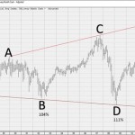
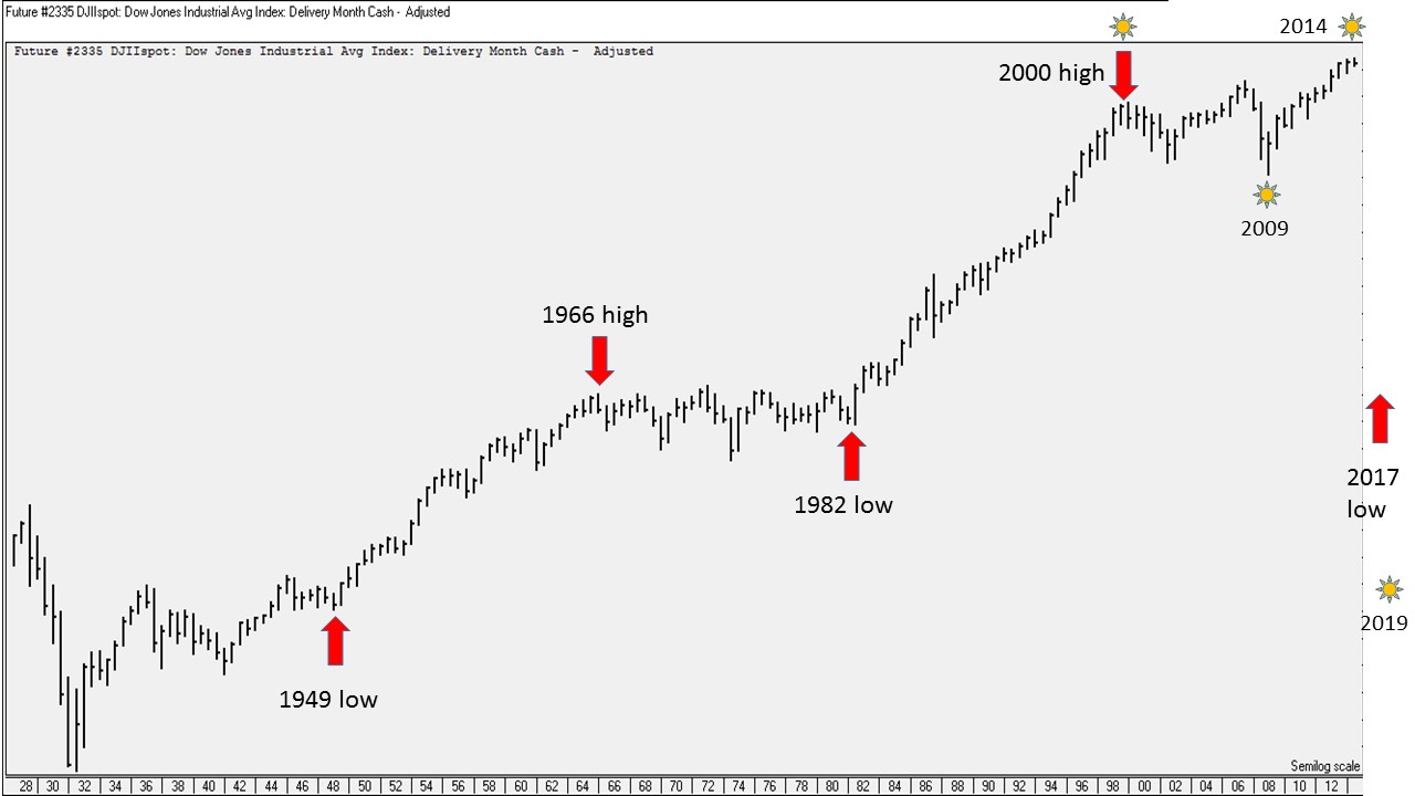
An 84-year cycle exists that ties the panic of 1847, the stock market low of 1932 and the year 2016. Within the 84-year cycle there are roughly 5, 17-year cycles (Figure III). After the base year 1932 we have the following years that were at or adjacent to important stock highs and lows:
- 1949 – marked the start of a multi-year bullish run
- 1966 – an important high that was only briefly exceeded in 1973
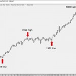
- 1983 – the important low that kicked off the greatest bull market in history occurred in August of 1982
- 2000 – by some measures the all-time high in U.S. stocks and the dot com bubble finale
- 2017 – ???
To reiterate, these cycles are not precise. The next cycle event could occur in 2016 or even 2018. Cycles can shift and in some cases go out of existence. If the alternation pattern continues, we can expect sometime around 2017 to mark the next major low. If we trust this cycle, and consider that it takes time to form a meaningful bottom, we can surmise that we are closer to a stock market high versus a low.
Figure III
Another cycle I would like to mention is the NASA-recognized 11-year sunspot phenomenon (Figure III). Sunspots are caused by fluctuations in the magnetic field surrounding our closest star. The sunspot activity can affect earth’s atmosphere and be disruptive to power transmissions and satellites.
Sunspots are also associated with stock market highs and lows. The last peak sunspot activity occurred in 2000, coincident with that important stock market top. A low in sunspot activity occurred in 2009, marking the most recent major low. The next peak was forecast in the 2013/2014 period. This peak is much lower than the one in 2000 and continues down until the year 2019. If sunspots do influence social mood, then it could serve to explain the weakness of the economic recovery (lower sunspot peak) and portends a lower stock market heading into 2019.
Other Observations
There are other observations I would like to note that demonstrate the market’s overall sentiment. These observations are contrarian.
- Retail money market funds compared to the overall market are at their lowest proportion ever. The ultralow interest rate environment is punishing savers and increasing investment risk for those who would otherwise be content with money market or CD rates. Historically the lower investment in money markets is associated with stock market tops. During the 2008-2009 period investors held more cash.
- Companies purchasing their own stock instead of reinvesting in their companies signify a greater expected return with the former. With borrowing costs low, companies are acquiring debt that must be paid back with the risk of a higher rate when debt is rolled over. These company purchases are creating artificial demand for equities.
- The stock market low of 2009 did not create the sentiment conditions attendant with a significant bear market. 401(k) contributions continued their direction towards stocks and target date funds, which depending on their year, can be heavily invested in equities. During a bear market bottom, investors are emotionally exhausted and need serious coaxing to return to the market. That did not occur in 2009.
- For the entire run from the 2009 bottom, trading volume exhibits a slight downward slope. Peak volume days since 2009 occur with more frequency when the market falls. This is not characteristic of a strong bull market.
Summary
The analyses presented depict a stock market that appears close to a significant top. Nothing mentioned presents a timing forecast. My proprietary algorithm, while not foolproof, suggests trend changes at different time horizons. At the moment (early August 2014), only a minor trend change is evident. The challenge for investors is deciding when they want to hold up or when they want to fold up. For most, this is a complex, emotional decision. A baseball hitter uses his eyes to determine the ball’s path and trusts that his hands will guide the bat accordingly. Investors will also have to trust their eyes to determine the market’s path and guide their decision-making as well. My eyes tell me the top is nigh.
Source:
The Position Of The Stock Market Right Now
Disclosure: The author has no positions in any stocks mentioned, and no plans to initiate any positions within the next 72 hours. The author wrote this article themselves, and it expresses their own opinions. The author is not receiving compensation for it (other than from Seeking Alpha). The author has no business relationship with any company whose stock is mentioned in this article. (More…)
Additional disclosure: The author has a small position in BEARX.
Continued:
The Position Of The Stock Market Right Now | Seeking Alpha
See which stocks are being affected by Social Media

