
U.S. Treasury Bonds, Gold And The Stock Market – iShares 20+ Year …
Summary
Our monthly “Continuum” chart anticipated a misstep for the “Great Rotation” crowd.
Yields are now approaching support, and we are no longer bullish on T bonds.
Beyond nominal bond considerations, the T bond market is key to in-depth macro analysis.
The following is one of a wide range of analytical topics covered in NFTRH 293′s 35 pages this week, much of which is straight ahead technical analysis. But the T Bond market is usually central to an overall macro view at any given time. This segment is not meant to provide actionable direction (other than perhaps to prepare for a potential rise in T bonds yields), it is meant to dig into the mechanics beneath the financial markets in an effort to have people consider that there is much more going on with markets than simple nominal TA or conventional fundamental analysis (P/E ratios, growth metrics, reported economic data, etc.) can account for.
US Treasury Bonds
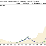
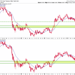
10 & 30yr yields have declined to support as we projected
Yields on long-term Treasuries have continued to decline in line with our view that was contrary the “Great Rotation” (out of bonds) hype. The 30-year especially is now close to support, and the next play seems like it could be rising yields and declining T bonds.
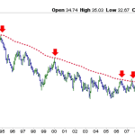
Our long-term “Continuum” chart; yields approach support
The 30-year “Continuum” view above makes the simple case that players had to be put offside believing in the “Great Rotation” at 4% yields. The nearly half-year decline since then has now satisfied the chart as yields have come to our 3.1% to 3.2% target range, where there is support.
It is interesting that stocks have continued to rise despite declining yields, whereas previously they had been rising with yields. One victim of this phenomenon, however, has been a stock market leader, the banks. It is no surprise at all that bank leadership broke down as yields broke down because ZIRP provides in essence free money where they borrow (Fed Funds) and higher long-term yields provides the implied profit incentive, where they package this stuff out to public and commercial borrowers.
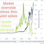
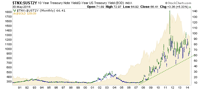
Moving on, we’ll close with the 10yr vs. 2yr yield curve with gold juxtaposed in the background.
It continues to be in the realm of possibility if not probability that the gold community’s trials and tribulations of the last 2.5 years has been fully earned as the most vocal boosters of the metal looked like utter geniuses in 2004 through 2007 when gold went up while the curve went down and we might add, gold went nowhere vs. commodities (ref. Gold-CCI on page 21).
That was a time when the fundamentals for gold and the gold stock sector were “not good” and “flat out awful,” respectively. That is because it was a time of economic expansion, not deceleration.
So tell me now, does the ongoing 2.5 year precious metals bloodbath make sense given that the economy is working relatively as current policy wants it to? Yes, it does make sense.
There is hype in the financial media about how a flattening curve is bad for stocks and the economy, but this chart puts a lie to that lazy analysis. The analysis claims that the curve is still elevated (nice understatement) and thus there is little to worry about.
A flat yield curve worked well enough in the secular bull into 2000, when the situation began to change and a rising curve attended the bear market out of the tech bubble. A flattening curve also attended the 2003 to 2007 cyclical bull market. In the post-2000 age of “Inflation on Demand”, a sharply rising curve has gone hand in hand with unprecedented upset in global financial markets. Most recently, however, the curve has dropped in accordance with economic recovery (ref: Operation Twist, which helped kick things off as it pressured short-term yields upward while pressuring long-term yields downward).
Again, much like with the Gold-CCI chart on page 21, if this big picture view breaks down so too must the analysis change to allow for its implications, which would be that a new era of prosperity has been created out of monetary policy. The thing is though, they have not broken down yet so instead, we stay the course and marvel at these charts showing just how desperate policy has been in its effort to keep the picture intact.
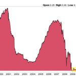
Dow & T Bill rate, long-term relationship
Closer view of the 3 month T Bill rate pinned to ZERO, 5 years & counting
Source:
U.S. Treasury Bonds, Gold And The Stock Market
Disclosure: I have no positions in any stocks mentioned, and no plans to initiate any positions within the next 72 hours. I wrote this article myself, and it expresses my own opinions. I am not receiving compensation for it. I have no business relationship with any company whose stock is mentioned in this article. (More…)
Additional disclosure: No positions were mentioned.
Originally posted here:
U.S. Treasury Bonds, Gold And The Stock Market – iShares 20+ Year …
See which stocks are being affected by Social Media

