
Short-term View of US Stock Market Averages – All Star Charts with …
Short-term View of US Stock Market AveragesPosted by JC Parets
on March 31st, 2014
As we finish up the first quarter, let’s take a look at all of the major US Stock Market Averages. Some of them are showing more strength than others, but similar support and resistance levels can be seen across the board. I came into the year bearish about the US Stock Market, and that has worked well so far with all of them up or down 1% YTD. But as always, I’m trying my best to keep an open mind. You have to.
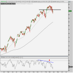
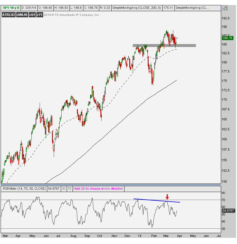
The first chart is the S&P500. We’ll use ETFs to keep things simple. Here is $SPY managing to stay above all of that January resistance. The bulls are still in control and there is nothing wrong with this chart until those levels are broken. Just below this critical 184-185 level is a 50 day moving average was well. One warning sign is the bearish momentum divergence at the recent highs. But price pays, so until this shaded area is broken, there is little to be overly concerned about.
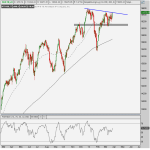
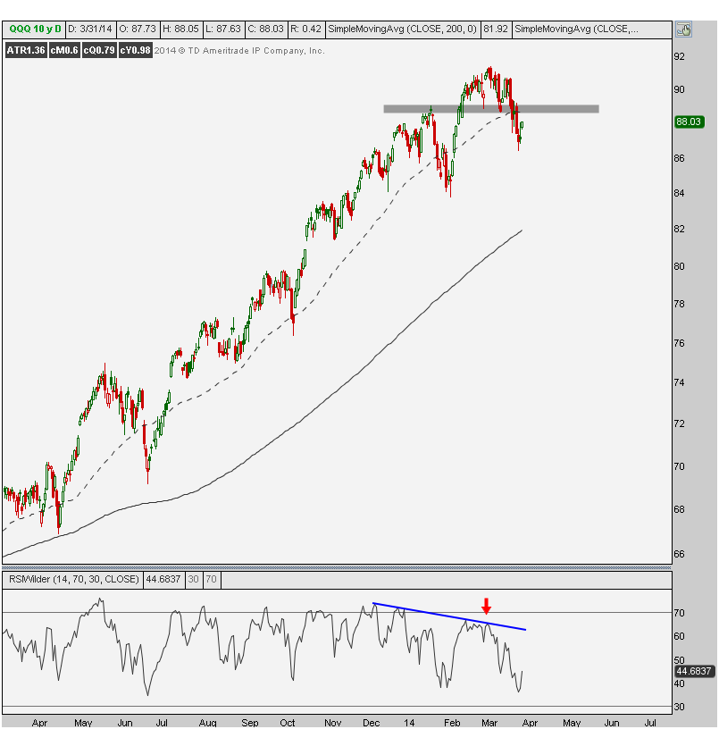
Notice the difference between the S&P500 and Nasdaq100. In the $QQQ chart below, the Nasdaq100 is already below the January resistance. The exact same shaded area seen up above in the S&P500 is drawn in the Nasdaq100. The bearish divergence in momentum is actually even worse than in the S&P500. This is why we put out a sell short Nasdaq call a week ago as long as prices are below 89.
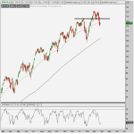
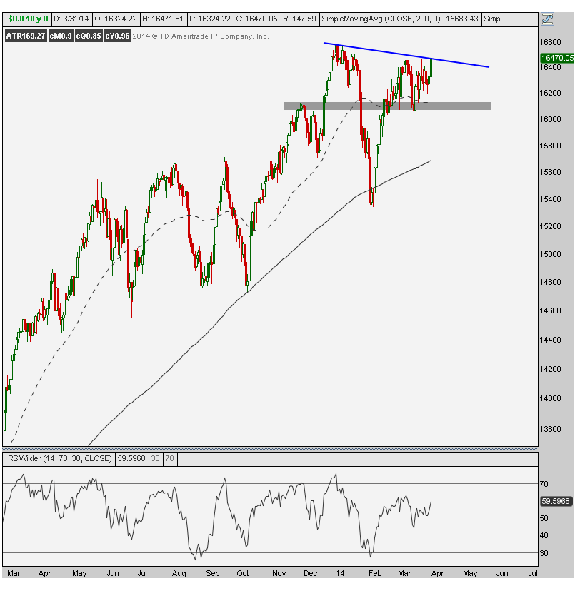
The Dow Jones Industrial Average is a bit of a difference story. The first thing that stands out is its inability to make a new high in March. While its counterparts were able to exceed their previous peaks, the Dow Industrials are still battling. This divergence has the Dow Theorists nervous (see here). Once again, it’s the shaded area that we’re watching here to signal more trouble ahead.
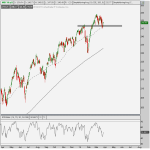
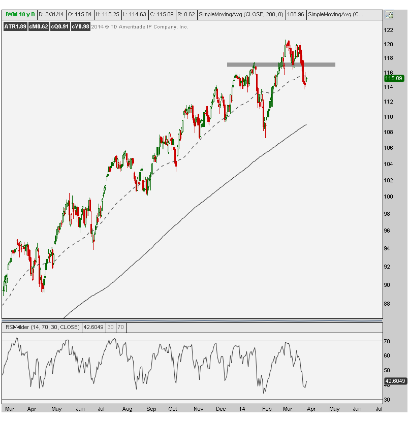
The next chart represents the Small-cap Russell 2000. This is another one that was able to make a new high into March and then failed quickly back below the January highs. We can put small-caps in the same category as the Nasdaq100. Bearish below the shaded line and more neutral/bullish above it.
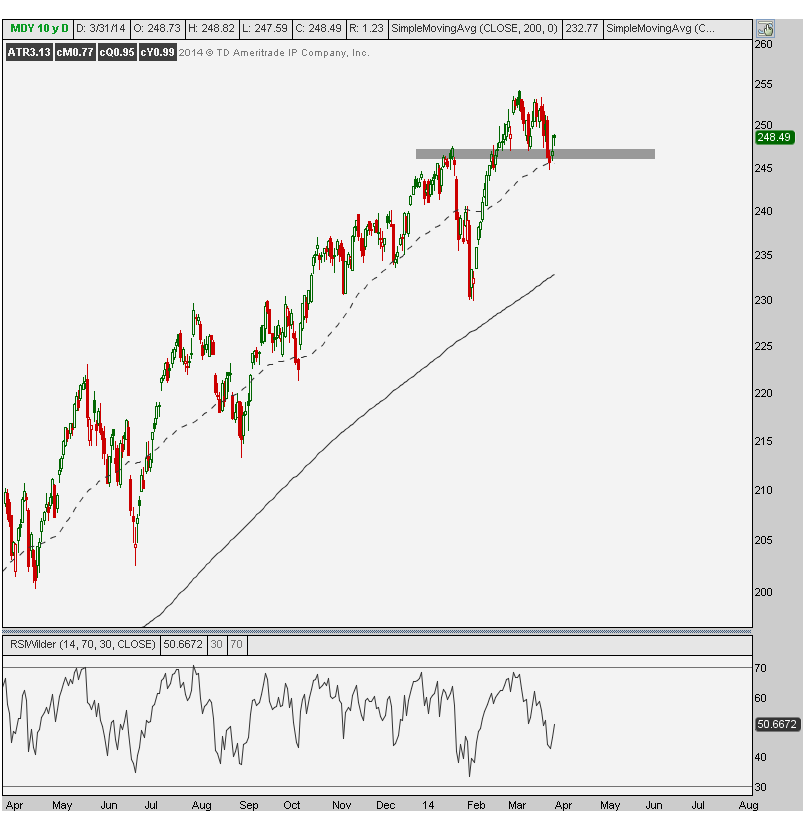
The Mid-caps look a lot like the S&P500. Here is the $MDY representing the Midcap400. Like the S&P500, Mid-caps made new highs into March and have so far retested their January highs and former resistance levels successfully. As long as last week’s lows hold, which represent the January highs and 50-day moving average, then the bulls are fine. Below that and things get hairy.
There are a lot of if/then statements here, and that’s for a good reason. I’m not certain of anything and if someone tells you they are, you should run. I look at all of my charts with a very open mind. I always try to assume I’ll be wrong and try to find a level that would signal that to me. Sometimes those levels are less clear and in those cases I try to stay away. Up here we can easily see which indexes are stronger and which ones are weaker so far in 2014. Comparing the averages tells us a lot, especially when these January/March levels have been so universally relevant.
These are the levels we’re watching. I think they’re the most important right now. If/when that changes, we’ll readjust our strategy.
I hope you find this breakdown useful. REGISTER HERE for more information on how to receive this analysis on multiple time frames, not just a short-term outlook like this.
Tags: $DJIA $DIA $DJI $QQQ $NDX $IWM $RUT $MDY $SPY $SPX $ES_F
Full Disclosure: Nothing on this site should ever be considered to be advice, research or an invitation to buy or sell any securities, please see my Terms & Conditions page for a full disclaimer.
View the discussion thread.blog comments powered by
Source:
Short-term View of US Stock Market Averages – All Star Charts with …
See which stocks are being affected by Social Media

