The Stock Market, In 6 Charts | Seeking Alpha
Lessons from Yahoo’s chart buttons
The news today is that the stock market is up! It’s hitting new record highs! Look at the chart! Here’s what the market did today:
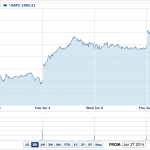
It opened up, thanks to the morning’s excellent jobs report, and then it kept on rising, and closed the half-day session with a gain of 0.55%.
A gain of 0.55% is pretty normal and unexceptional: it’s well within the standard range of what the stock market does on most days. So why is this day noteworthy? For two reasons. One, the market hit a new high today, and any new high, even if it’s only a tiny increase on the old high, is considered newsworthy. Two, the Dow hit 17,000, which has lots of zeroes in it. This is considered newsworthy despite the fact that every single financial journalist knows that the Dow is a really stupid indicator.
Still, since we’re looking at the stock market, let’s look at the stock market, by hitting those successive buttons along the bottom of the Yahoo interactive chart. The one-day chart comes first, and the main thing we can learn from this chart is that we’re in good-news-is-good-news territory. We had a very positive payrolls report this morning, with lots of people being hired and unemployment falling, and stocks went up as a result. Sometimes, we have a negative payrolls report, with very few people being hired and unemployment going nowhere, and stocks also go up as a result. But the worrying thing, from the perspective of someone looking at the market, is when stocks go up on both good news and bad news, which is where we seem to be right now. That’s a sign of feverishness.
The next button shows us the five-day chart:
Here at least we have the beginnings of a noteworthy move in stocks: 1.59% is meaningful, if not huge. We also have a clear pattern - stocks are rising. If you sit on your stock portfolio and do nothing, the chances are that you’ll make money, any given day. Which starts to add up, when we move on to the next buttons. The one-month return is 2.62%, the three-month return is 4.55%, and the six-month return is 7.82%. These are numbers to hearten any investor.
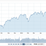
We’ll skip over YTD, which is pretty much the same as six months at this time of year, and move on to the one-year chart, where we start being able to put all of these numbers in perspective:
This is a downright spectacular chart - if you just held on to an S&P 500 index fund for the past year, you’d be up 22.24%, with very little volatility. This chart goes pretty smoothly up and to the right, at an astonishing, inexorable pace.
The worrying thing here is that if you think back to what has actually happened over the past year, the answer is not very much: there’s no particular reason that the corporate world should be worth 22.24% more today than it was a year ago.
The most important driver of stock prices is earnings, and right now the S&P 500 shares, between them, are expected to have $119.50 in earnings this year. This time last year, the expected 2014 earnings for the S&P 500 were… $123.01. In other words, the stock market has gone up, spectacularly, even though the companies in the stock market are underperforming expectations. Again, this is worrying.
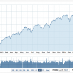
If you were worried by the one-year chart, the two-year chart is downright terrifying:
This is basically just a smooth line, heading up and to the right, and rising by a crazy 43.71% in two years. Those are the kind of returns, at very low volatility, that hedge-fund managers would kill for, and for the past two years they’ve been available to anybody with an index fund. This is not sustainable. But how will it play out? And how far are we from the end of the bull run? Let’s look at the five-year chart:
Here we see stocks going up 124.61% over five years - you’re more than doubling your money, even after accounting for inflation. And while there were some periods of choppiness in there, those days seem to be behind us now: we’re in a period of smooth sailing and a pleasantly steep upwards gradient.
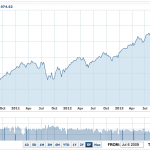
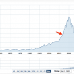
Still, it’s hard to get very scared just by looking at charts which go steadily up and to the right. So let’s click that final “Max” button:
This time we won’t pay much attention to the total return number: precious few of us were investing in the broad stock market in 1950. But finally what we can see is the danger in the stock market: the huge crash following the dot-com bubble, the equally big crash following the global financial crisis, and then the mad spike which we just saw in the five-year chart. A spike which, in this context, looks downright insane.
I’ve also added a little red arrow to the chart, around December 1996. That arrow marks the point at which Alan Greenspan gave his notorious “irrational exuberance” speech. Greenspan was worried that stock prices were too high - but in hindsight we were just entering a prolonged period of crazy, a period which is far from over.
All of which is to say that today’s record stock prices are more a cause for concern than for celebration. They’re great if you’re selling, but they’re very worrying if you’re buying: how much more can they possibly rise, and even if they do, what are the chances that you’re going to be able to get out before the inevitable plunge? Those of us who have good jobs and are saving for retirement need to put our money somewhere, and that means that we need to invest it in the stock market. But the stocks we’re buying have never been more expensive. Which makes them a decidedly dubious investment.
I still think that index funds are the best place for long-term savings, and indeed anybody who didn’t invest in index funds over the past five years has lost out on some spectacular returns. But do be careful with any money you can’t afford to lose. Because however fast stocks go up, they tend to go down even faster.
Originally published on Medium
Source:
View this article –
The Stock Market, In 6 Charts | Seeking Alpha
See which stocks are being affected by Social Media