
Stock Market Intra-Year Decline Chart – Business Insider
There’s always some pain to endure.
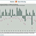
Perhaps there’s no better encapsulation of that market maxim than this chart from J.P. Morgan Asset Management’s Paul Quinsee.
It shows S&P 500 intra-year declines versus calendar year returns. The bar represents year-end returns since 1980, while the little purple dot shows how low the market went each year.
What you find is that investors must stomach not-insignificant drawdowns to get their buy and hold returns — even in big years. Basically, you have to be prepared to lose 10-15% of your money and not freak out.
Looking at 2013, Quinsee notes that a -6% low point is a pretty small level of pain, and investors shouldn’t expect such luck in 2014. If nothing goes majorly south in the next month, this year will have the smallest pullback since 1995. It’s a chart investors would be wise to keep nearby, says Quinsee.
JP Morgan Funds
Link:
Stock Market Intra-Year Decline Chart – Business Insider
See which stocks are being affected by Social Media

