
Technical analysis using Japanese candlesticks | Live Trading News

Technical analysis using Japanese candlesticks
Posted by: : Shayne HeffernanPosted on: July 11, 2014 Get more from your trading with HEFFX
Japanese candlesticks are a way of presenting the price action over a set period of time. They provide useful information, such as the market sentiment or possible reversals in the markets, by showing the price movement in a specific way.
A Japanese candlestick chart shows you more information
When you trade something, whether it is forex, stocks or commodities, you will use price charts to see the price movement in the markets.
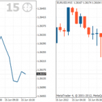
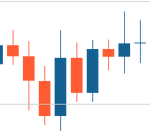
Consider the following two charts:
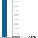
The line chart on the left is a very simple way of showing the price movement. It displays the information with a simple line using a series of data points. It is the type of chart that you may be used to seeing in magazines and newspapers that shows the price movement of stocks and shares.
A line chart is simplistic and only displays price movement in a line. A Japanese candlestick chart shows more information within each individual candlestick.
The Japanese candlestick chart to the right shows the same price movement, however it is made up of individual candlesticks. Traders prefer to read candlestick charts because they include more information than a line chart and can be more useful for making trading decisions.
Japanese candlesticks represent a set period of time
If a Japanese candlestick chart is set to a 30 minute time period, then each individual candle will form over thirty minutes. Likewise, if the chart is set to a 15 minute time period, then each candle will take fifteen minutes to form.
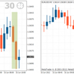
Consider the following charts:
Each chart shows the price action for the EUR/USD. The two candles in the green shaded area in the left chart are two 30 minute candles. This represents the exact same period as the twelve shaded candles on the 5 minute chart to the right.
Each Japanese candlestick represents a specific time frame. If the time period is set for 30 minutes, then each individual candle will take 30 minutes to form.
The two charts are showing the price action of the same asset, only the chart to the left is showing the price action over a much longer period than the chart to the right.
This is because the chart to the left is a 30 minute chart, meaning that each candle took thirty minutes to form, and the chart to the right is a 5 minute chart, meaning that each candlestick took five minutes to form. The 30 minute chart therefore shows a much broader time scale of price action than the 5 minute chart.
Get more from your trading with HEFFX
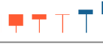
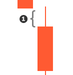
Each candle shows the open, close, high and low price
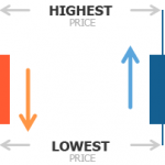
Take a look at the following image:
The wide part of the candlestick is called the body. It represents the open and close of the period. This means that if the chart is a 1 hour chart, then each candlestick body will show the opening price for that 1 hour period and the closing price for that 1 hour period. The wicks at the top and the bottom of the candlestick show the highest and lowest price reached during that 1 hour period. A chart that displays the open, high, low and close price for a given period is referred to as a OHLC chart.
OHLC
The opening price, highest price, lowest price and closing price of a given period is often referred to as the OHLC. Charts that display this information are often called OHLC charts.
The different colours of the body tell you if the candlestick is bullish (rising) or bearish (falling). At tradimo, we have set our candlesticks to orange for bearish candles and blue for bullish candles. It does not matter what colour your candlesticks are; they can be set to any colour in your trading software.
If the candlestick is bullish, then the opening price is always at the bottom and the closing price is always at the top. If the candlestick is bearish, then the opening price is always at the top and the closing price is always at the bottom.
The different colours simply provide a means for you to instantly tell if they are bullish or bearish.
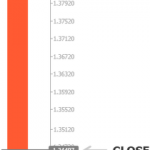
A closer look at a bearish Japanese candlestick
The candlestick in this illustration is a period of 1 day, which means that the candle took an entire day to form. The currency pair is the EUR/USD.
From the candle you can identify the following information:
The candle is bearish because of its orange colour. This means that over the course of a single day the price of the EUR/USD dropped. There were more sellers than buyers throughout the day; the price was lower at the close of the day than when it opened.
The price at the beginning of the day opened at 1.38278.
The price at the end of the day closed at 1.34497.
Throughout the day, the highest price that the buyers pushed the EUR/USD to was 1.38600.
Throughout the day, the lowest price that the sellers pushed the EUR/USD to was 1.34125.
This, however, only shows the OHLC for that day. If you wanted to see the price movement in more detail, you would go to a lower time frame.
Using the example above, to find out more specifically what happened during the course of that day – that day being the single candlestick shown – you could go to a 1 hour time frame chart. This chart would show candlesticks that more accurately depict the price movement throughout the day.
Similarly, you could go to an even lower time frame – say, a 15 minute or a 5 minute time frame – and find out how the price behaved in even more detail.
You will explore the methods of choosing which time frame best suits your trading style in further lessons.
A further example using a bullish Japanese candlestick
The candlestick in this illustration is a one hour period, which means that the candle took an hour to form. The currency pair is EUR/USD.
From the candle you can identify the following information:
The candle is bullish because it is blue. This means that over the course of an hour, the price of the EUR/USD increased. There were more buyers than sellers throughout the hour; the price was higher at the close of the hour than when it opened.
The price at the beginning of the hour opened at 1.3016.
The price at the end of the hour closed at 1.3175.
Throughout the course of the hour the highest price that the buyers pushed the EUR/USD to was 1.3185.
Throughout the hour the lowest price that the sellers pushed the EUR/USD to 1.2956.
Although a trader can use practically any time period for each candle, the most common periods are M1 (1 minute), M5, M15, M30, H1 (1 hour), H4, D1 (1 day), W1 (1 week) and MN1 (1 month). The time frames that are available for your use will depend on the trading platform you choose to use.
Summary
So far, you have learned that …
… the Japanese candlestick chart shows you more information than a simple line chart.
…the Japanese candlestick chart is the most common type of chart used by traders
… Japanese candlesticks represent the time that the candle takes to form, which is referred to as a time frame.
… each candlestick tells you the open, high, low and close (OHLC) price of the time frame for that candle.
… an orange candle means that the price has moved down and a blue candle means that the price has moved up.
Japanese candlesticks can be used in conjunction to identify the current market conditions and the possible future price direction. This is done by using the information they present to show the balance between the buyers and sellers in the markets. This in turn allows you to identify the market sentiment.
Assessing the balance between the buyers and the sellers
The longer the body of a candlestick, the more momentum there is in that direction. What this means is:
The longer a bullish candlestick, the more buying pressure there is in comparison to selling pressure for that period.
The longer a bearish candlestick, the more selling pressure there is in comparison to buying pressure for that period.
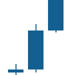
Comparing candles in practice to assess the balance
The three candles to the right are all bullish candles; over the course of each of these time periods there were more buyers than sellers (the closing price was higher than the opening price).
Candle number_2 is larger than candle number_1. This indicates that there was more momentum to the upside in the second candle compared to the first. The buyers were able to push the price higher in the same amount of time as the first candle. Comparing the candles, it can be seen that the balance is shifting more and more in favour of the bulls.
Candle number_3 is even larger than candle number_2. This indicates that not only is the balance continuing to shift in favour of the bulls, but the momentum in buying pressure is continuing to increase as well.
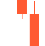
Comparing bearish candlesticks in the same manner
The candles to the right are all bearish, meaning that over the course of these time periods there were more sellers than buyers. In comparison, candle number_2 is larger than candle number_1, indicating that there was more momentum to the downside in the second candle compared to the first.
The sellers were able to push the price lower in the second candle than in the first, and it can be seen that the balance has shifted more in favour of the sellers.
Candle number_3 is much larger than candle number_2, indicating that not only is the balance continually shifting in favour of the bears, but the momentum in selling pressure is increasing too.
Observing this kind of shift in the balance between the buyers and sellers helps to determine whether the market sentiment is likely to be bullish or bearish. If the balance is shifting towards the bulls, then the direction of the market is likely to be to the upside; if the balance is shifting towards the bears, then the direction in the market is likely to be to the downside.
Interpreting the size of the candlestick wicks
The candlestick to the right is a bullish candle. It has a long wick at the bottom and almost no wick at the top. During the time frame of this candle forming, the bears attempted to push the price down. However, the balance shifted back towards the bulls and the buyers pushed the price back past the opening price – the candle ended up closing as a bullish candle.
The illustration to the right shows how the candle could have looked during its formation.
The fact that the bulls managed to push the price back up from the low of the candlestick, past the open, and up to where it closed, indicates strong momentum in buying pressure.
A long wick, such as the illustration above to the right shown as number_1, therefore indicates that during the course of the candle, a shift in balance occurred from one side to the other– in this case from the sellers to the buyers. This provides an insight into which direction the momentum is likely to continue occurring.
The doji candlestick
A doji candlestick pattern is a candlestick in which the opening and the closing price are the same, as the image to the right shows.
If there is a difference of just a few pips between the open and the closing price, then it is generally still considered to be doji.
This type of candle is neither bullish nor bearish and indicates that the buying and selling pressure is relatively equal – there is indecision in the market. A doji can sometimes indicate a reversal if found at the end of a large price movement.
Caution with interpreting open candlesticks
A candlestick that is still open does not provide any useful information as the dynamics of that candle can still change. This means that you cannot analyse the very last candle on the price chart; you can only analyse the prior candles. This is very important to know when making decisions about trading.
The illustration above and to the left shows a 4 hour chart. The last candle shown is still open and has not finished forming. The price is moving to the upside indicating a strong bullish tendency. At this point, the buyers are in control and it appears that this will form as a bullish candle.
However, the chart to the right shows that within the time period of the four hours, the candle changed completely. The balance has shifted towards the bears. It now appears that the candle will form as a bearish candle.
Until the candle closes, there is no way to tell how the candle will eventually form. You should not make assumptions, carry out analysis or enter trades based on an open candle.
Gaps between open and close of the candlesticks
You may notice that in the illustration examples provided, each candlestick opens where the previous candlestick closes. Although this is logical, it is not always the case. As the illustration to the right demonstrates, occasionally a gap number_1 is created between the close and the open of two candlesticks.
There are multiple reasons for this, the main one being that the price shifted while the normal markets were closed. Therefore, the opening price will be different to the closing price when the markets open again.
Summary
So far, you have learned that …
… the longer the body of a candlestick the further the price moved in that time period and so the more momentum there is pushing the price in that particular direction.
… an increase in market sentiment can be identified by comparing the candlesticks against one another.
… a bearish body means that sellers are currently in control and a bullish body means that the buyers are currently in control over the course of that period.
… long wicks indicate that there has been a shift in balance between the buyers and sellers – from one side to the other – within that period.
… a doji candlestick represents market indecision where neither the buyers nor the sellers were in control.
… only a closed candlestick should be taken into account because the sentiment can change within the time of that candle.
The following two tabs change content below.Bio
Latest Posts
Shayne Heffernan holds a Ph.D. in Economics and brings with him over 25 years of trading experience in Asia and hands on experience in Venture Capital, he has been involved in several start ups that have seen market capitalization over $500m and 1 that reach a peak market cap of $15b. He has managed and overseen start ups in Mining, Shipping, Technology and Financial Services.What’s New From Apple Inc (NASDAQ:AAPL)? – July 11, 2014
Apple Inc (NASDAQ:AAPL) To Create Ripples In Auto Industry With “Carplay” – July 11, 2014
EURUSD: USD Gains As EU Banks Trigger Crisis – July 11, 2014
Nanotech Entertainment, Inc.(OTCMKTS:NTEK) Holds Promise With Media Player – July 11, 2014
Copay: New Bitcoin Payment Platform – July 11, 2014
Original source:
Technical analysis using Japanese candlesticks | Live Trading News
See which stocks are being affected by Social Media