
Stock Market Crash – Business Insider
Stocks are tanking today.
This move mirrors other dives in recent weeks — a decline that has taken the tech-heavy NASDAQ down 7% from its highs and the S&P and Dow about 3% from their highs.
Drops like that are no big deal.
But some signs suggest that this pullback — or another one sometime soon — could get much more severe.
Why?
Three basic reasons:
Stocks are still very expensive
Corporate profit margins are at record highs, and
The Fed is now tightening
Let’s take those one at a time.
First, price.
Even after the recent drops, stocks appear to be very expensive.
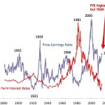
The chart below is from Yale professor Robert Shiller. It shows the cyclically adjusted price-earnings ratio of the S&P 500 for the last 130 years. As you can see, today’s P/E ratio of 25X is miles above the long-term average of 15X. In fact, it’s higher than at any point in the 20th Century with the exception of the peaks of 1929 and 2000 (and you know what happened after those).
Robert Shiller, Business Insider
Does a high PE mean the market is going to crash? No. But unless it’s “different this time,” a high PE means we’re likely to have lousy returns for the next 7-10 years.
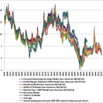
By the way, in case some of your bullish friends have convinced you that Professor Shiller’s P/E analysis is flawed, check out the chart below. It’s from fund manager John Hussman. It shows 6 valuation measures in addition to the Shiller P/E that have been highly predictive of future returns over the past century. The left-hand scale shows the predicted 10-year return for stocks according to each valuation measure. The colored lines (except green) show the predicted return for that measure at any given time. The green line is the actual return over the 10 years from that point (it ends 10 years ago, for obvious reasons). Today, the average expected return for the next 10 years is slightly positive — about 2% a year. That’s not horrible. But it’s a far cry from the 10% long-term average.
So that’s price. Next comes profit margins.
One reason stocks are so expensive these days is that investors are comparing stock prices to this year’s earnings and next year’s expected earnings. In some years, when profit margins are normal, this valuation measure is meaningful. In other years, however — at the peak or trough of the business cycle — comparing prices to one year’s earnings can produce a very misleading sense of value.
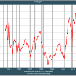
Have a glance at this recent chart of profits as a percent of the economy. Today’s profit margins are the highest in history, by a mile. Note that, in every previous instance in which profit margins have reached extreme levels — high and low — they have subsequently reverted to (or beyond) the mean. And when profit margins have reverted, so have stock prices.
Business Insider, St. Louis Fed
After-tax profits as a percent of GDP.
Now, you can tell yourself stories about why, this time, profit margins have reached a “permanently high plateau,” as a famous economist remarked about stock prices in 1929. And you might be right. But as you are telling yourself these stories, please recognize that what you are really saying is “It’s different this time.” And “it’s different this time” has been described as “the four most expensive words in the English language.”
And then there’s Fed tightening.
For the last 5 years, the Fed has been frantically pumping money into Wall Street, keeping interest rates low to encourage hedge funds and other investors to borrow and speculate. This free money, and the resulting speculation, have helped drive stocks to their current very-expensive levels.
But now the Fed is starting to “take away the punch bowl,” as Wall Street is fond of saying.
Specifically, the Fed is beginning to reduce the amount of money that it is pumping into Wall Street.
To be sure, for now, the Fed is still pumping oceans of money into Wall Street. But, in the past, it has been the change in direction of Fed money-pumping that has been important to the stock market, not the absolute level.
In the past, major changes in direction of Fed money-pumping have often been followed by changes in direction of stock prices. Not always. But often.
Let’s go to the history…
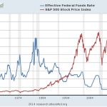
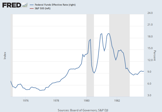
Here’s a look at the last 50 years. The blue line is the Fed Funds rate (a proxy for the level of Fed money-pumping.) The red line is the S&P 500. We’ll zoom in on specific periods in a moment. But just note that Fed policy goes through “tightening” and “easing” phases, just as stocks go through bull and bear markets. And sometimes these phases are correlated.
Business Insider, St. Louis Fed
Now, lets zoom in. In many of these time periods, you’ll see that sustained Fed tightening has often been followed by a decline in stock prices. Again, not always, but often. You’ll also see that most major declines in stock prices over this period have been preceded by Fed tightening.
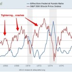
Here’s the first period, 1964-1980. There were three big tightening phases during this period (blue line)…and three big stock drops (red line). Good correlation!
Business Insider, St. Louis Fed
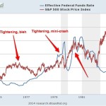
Now 1975-1982, which overlaps a bit with the chart above. The Fed started tightening in 1976, at which point the market declined and then flattened for 4 years. Steeper tightening cycles in 1979 and 1980 were also followed by price drops.
Business Insider, St. Louis Fed
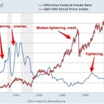
From 1978-1990, we see the two drawdowns described above, as well as another tightening cycle followed by flattening stock prices in the late 1980s. Again, tightening precedes crashes.
Business Insider, St. Louis Fed
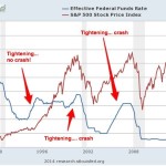
And, lastly, 1990-2014. For those who want to believe that Fed tightening is irrelevant, there’s good news here: A sharp tightening cycle in the mid-1990s did not lead to a crash! Alas, two other tightening cycles, one in 1999-2000 and the other from 2004-2007 were followed by major stock-market crashes.
Business Insider, St. Louis Fed
One of the oldest sayings on Wall Street is “Don’t fight the Fed.” This saying has meaning in both directions, when the Fed is easing and when it is tightening. A glance at these charts shows why.
On the positive side, the Fed’s tightening phases have often lasted a year or two before stock prices peaked and began to drop. So even if you’re persuaded that sustained Fed tightening now will likely lead to a sharp stock-price pullback at some point, the bull market might still have a ways to run.
But if the recent stock weakness turns out to be the start of a major pullback, don’t say you weren’t warned!
SEE ALSO: Anyone Who Thinks Stocks Will Go Up If The Economy Grows Should Read This Buffett Quote
This article is from:
Stock Market Crash – Business Insider
See which stocks are being affected by Social Media

